

ProAct
Branding for a Predictive Maintenance AI software

Overview
ProAct is a predictive maintenance solution built for industries where downtime isn’t an option. It monitors performance, identifies risks before they become failures, and keeps operations moving without costly surprises.
The brand needed to communicate intelligence, precision, and forward momentum all without feeling cold or over-technical.
Creative Direction
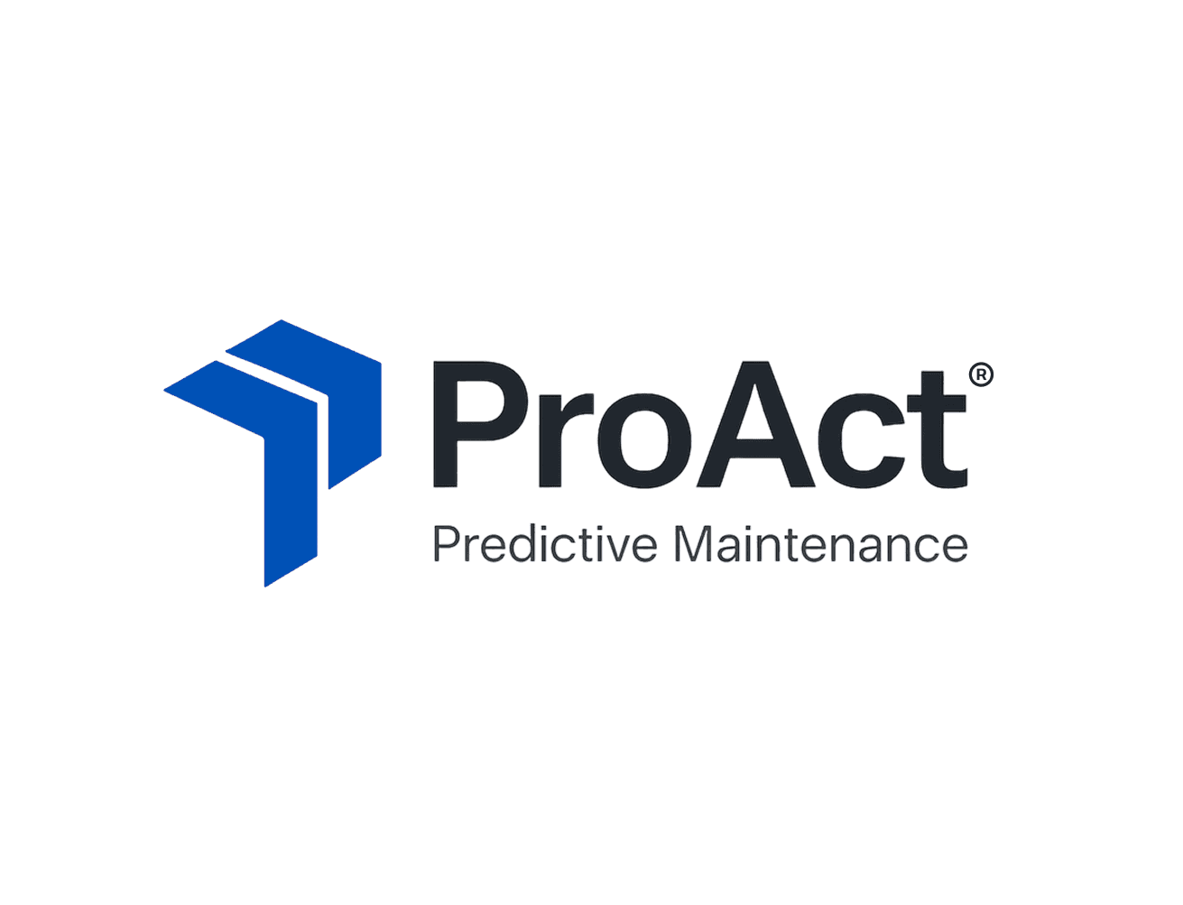
The identity is built on precision and forward motion. The two angled forms create a directional arrow, symbolizing progress, foresight, and upward movement. They can also be read as clock hands, reinforcing timing and accuracy — the essence of predictive maintenance. This dual meaning anchors the brand in both action and anticipation.
Two angled shapes = progress, timing, proactive insight
Bold sans serif font = confident, modern, highly legible
Horizontal lockup = versatile across dashboards, panels, & materials
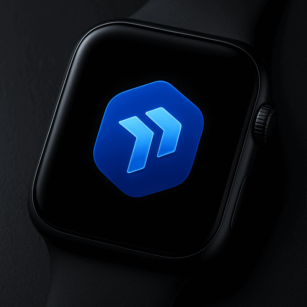
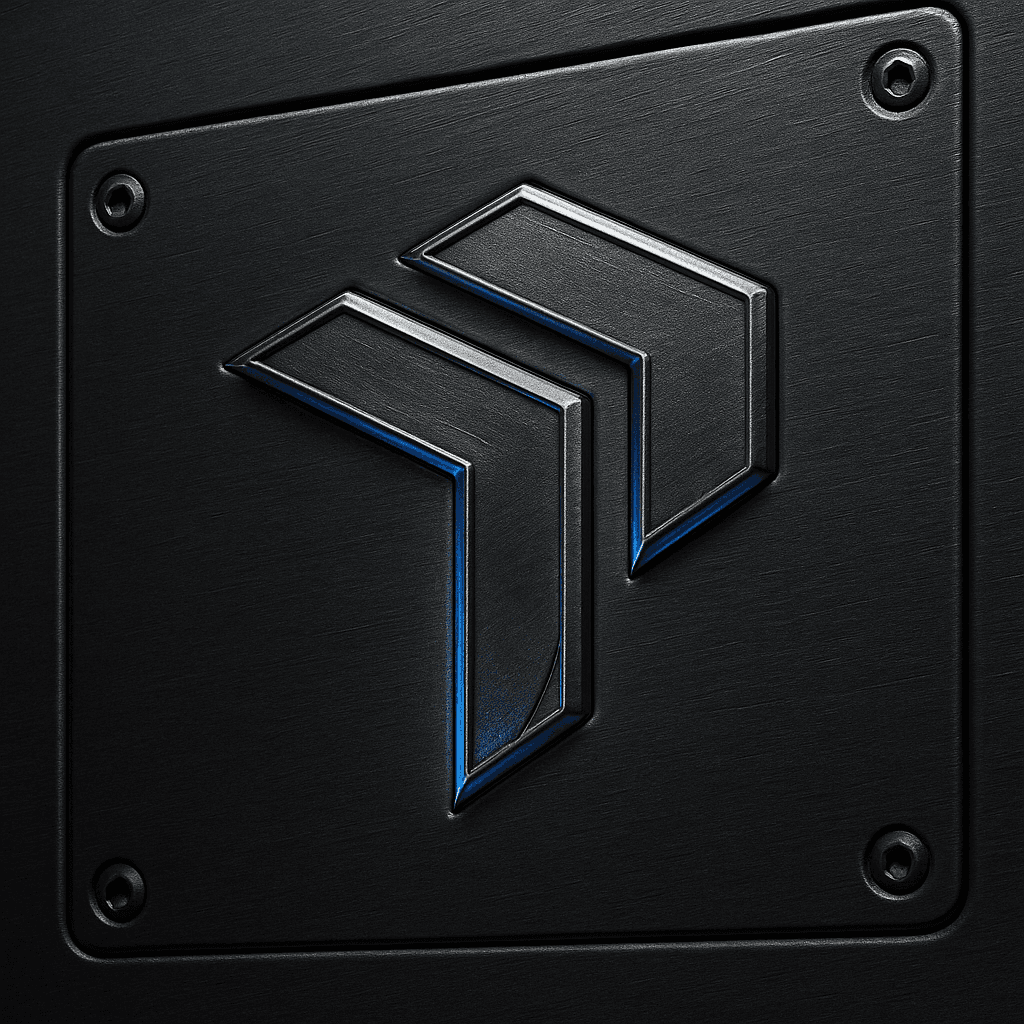
Designed to adapt, the logo holds its presence on a machinery control panel, a mobile interface, or a profile icon, always recognizable and always ahead of the curve.
Design Language
The visual style is clear, high-impact, and engineered for trust in industrial environments.
Color Palette – Technical & Assured
ProAct Blue (#0052CC): Trust, reliability, and focus
Deep Black (#1B1B1B): Strength, contrast, and precision
White (#FFFFFF): Clean clarity for digital and print
These colors create a balance between authority and approachability, performing equally well in dark industrial settings and bright digital interfaces.
Typography – Clear & Direct
Primary: Bold modern sans serif for headings, built for instant recognition
Secondary: Lighter weight of the same family for supporting text, maintaining consistency and readability
The type system keeps the tone confident, uncluttered, and functional, ensuring ProAct’s message is delivered with precision.

Final Thoughts
ProAct’s identity is not about looking flashy. It is about expressing the quiet confidence of a system that sees problems before they happen. It is the visual embodiment of readiness, reliability, and results.
Next Project
Get a sneak peek at what’s coming next—innovation in the making

