
La Venora – Keep It Vintage
Visual Identity Design for Old Money Clothing Brand
Overview
La Venora is a premium fashion label inspired by the quiet luxury and timeless sophistication of the old money aesthetic. The brand needed an identity that conveyed prestige without pretense, a mark that whispers legacy rather than shouts trend.
This project involved creating a complete brand system centered around a bespoke logo, signature typography, heritage-inspired color palette, and product application across apparel, packaging, and accessories.
Creative Direction
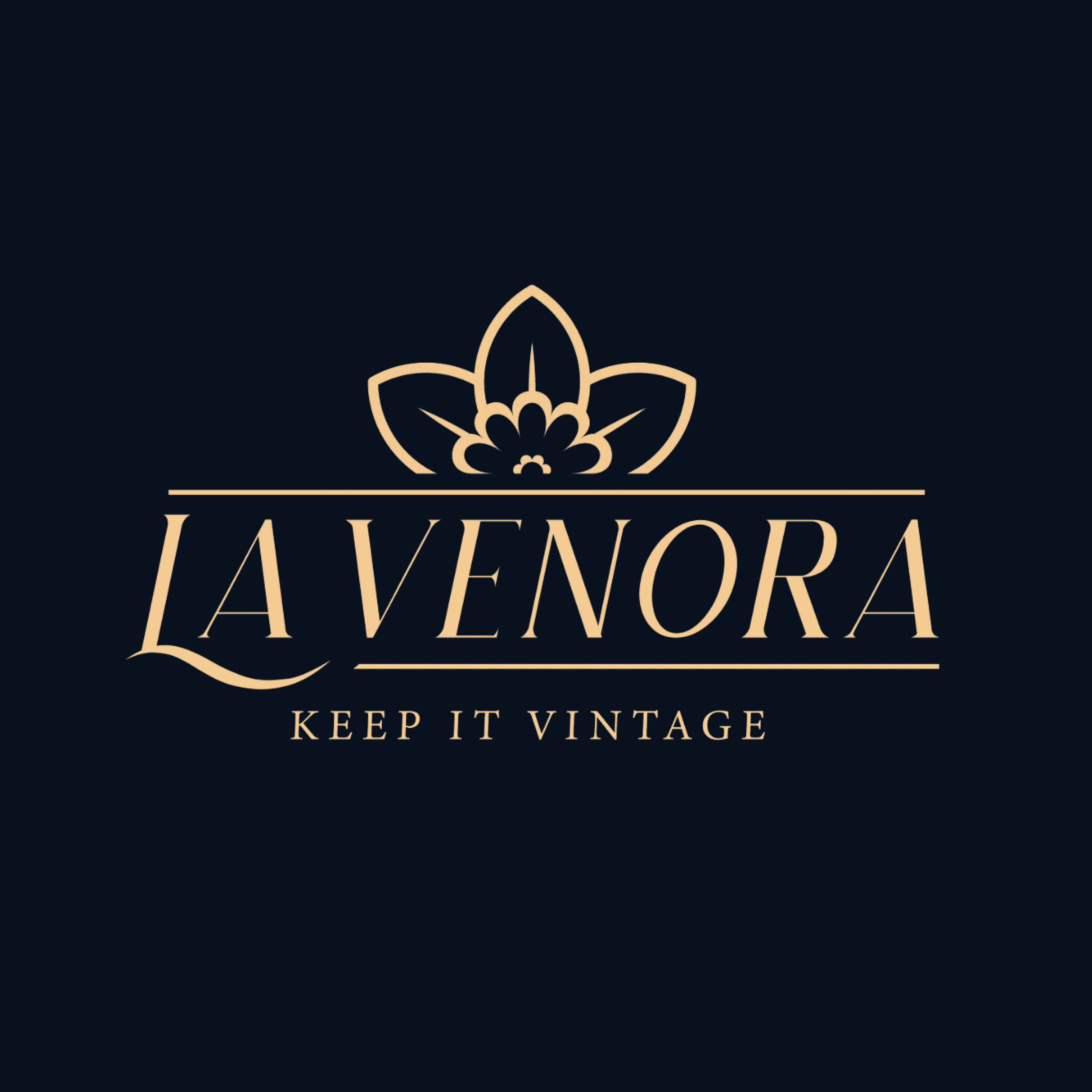
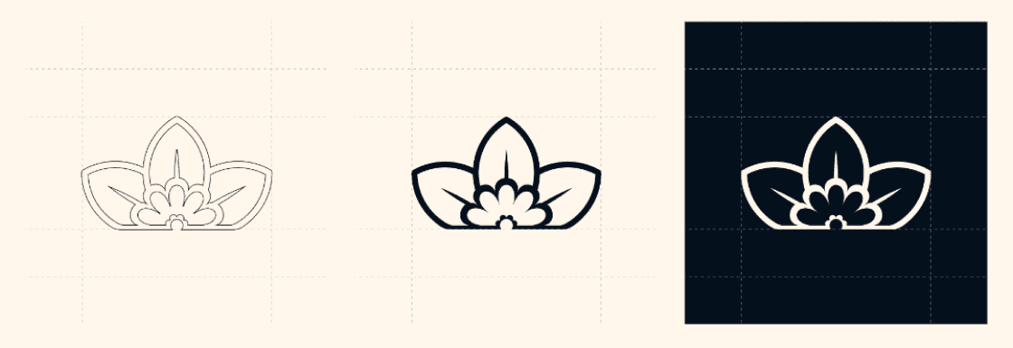
The La Venora logo features a bespoke serif wordmark and a stylized daffodil crest. This floral icon, sitting above the name like a royal seal, evokes both nobility and honesty, a visual embodiment of “truth in elegance.”
Why the daffodil?
It symbolizes truth and renewal, mirroring the brand’s timeless but fresh approach
It ties back to the poetic spirit of La Verona, grounding the identity in literary and cultural roots
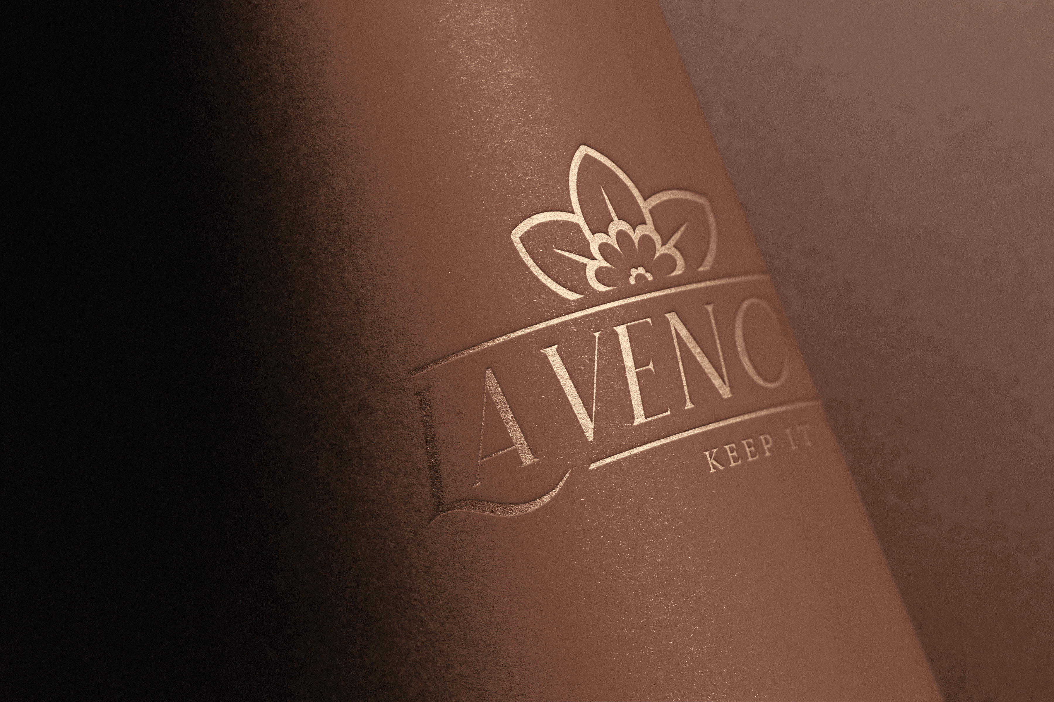
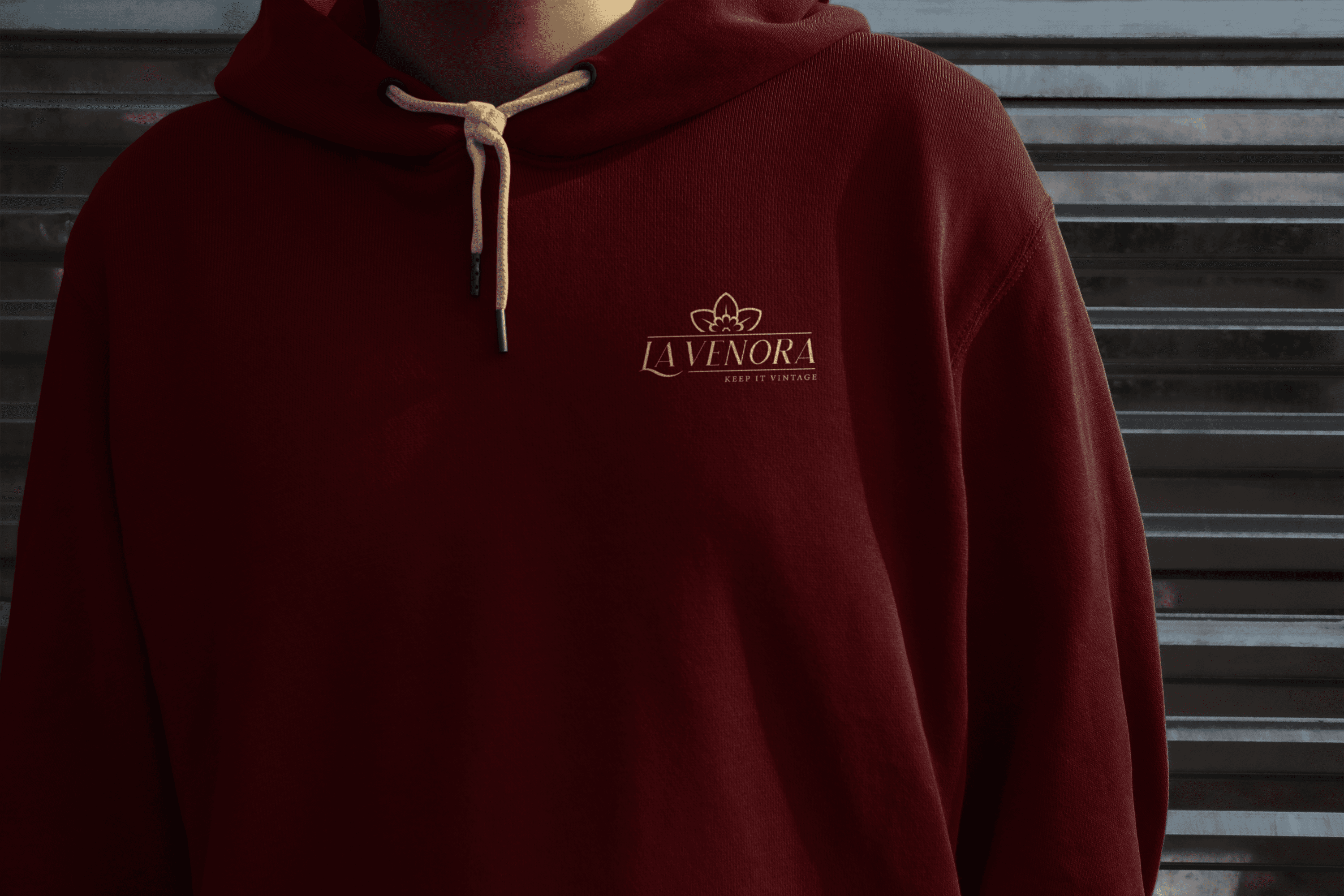
The logo is designed for versatility:
Embroidered on apparel
Foil-stamped on packaging
Embossed on premium accessories

Design Language
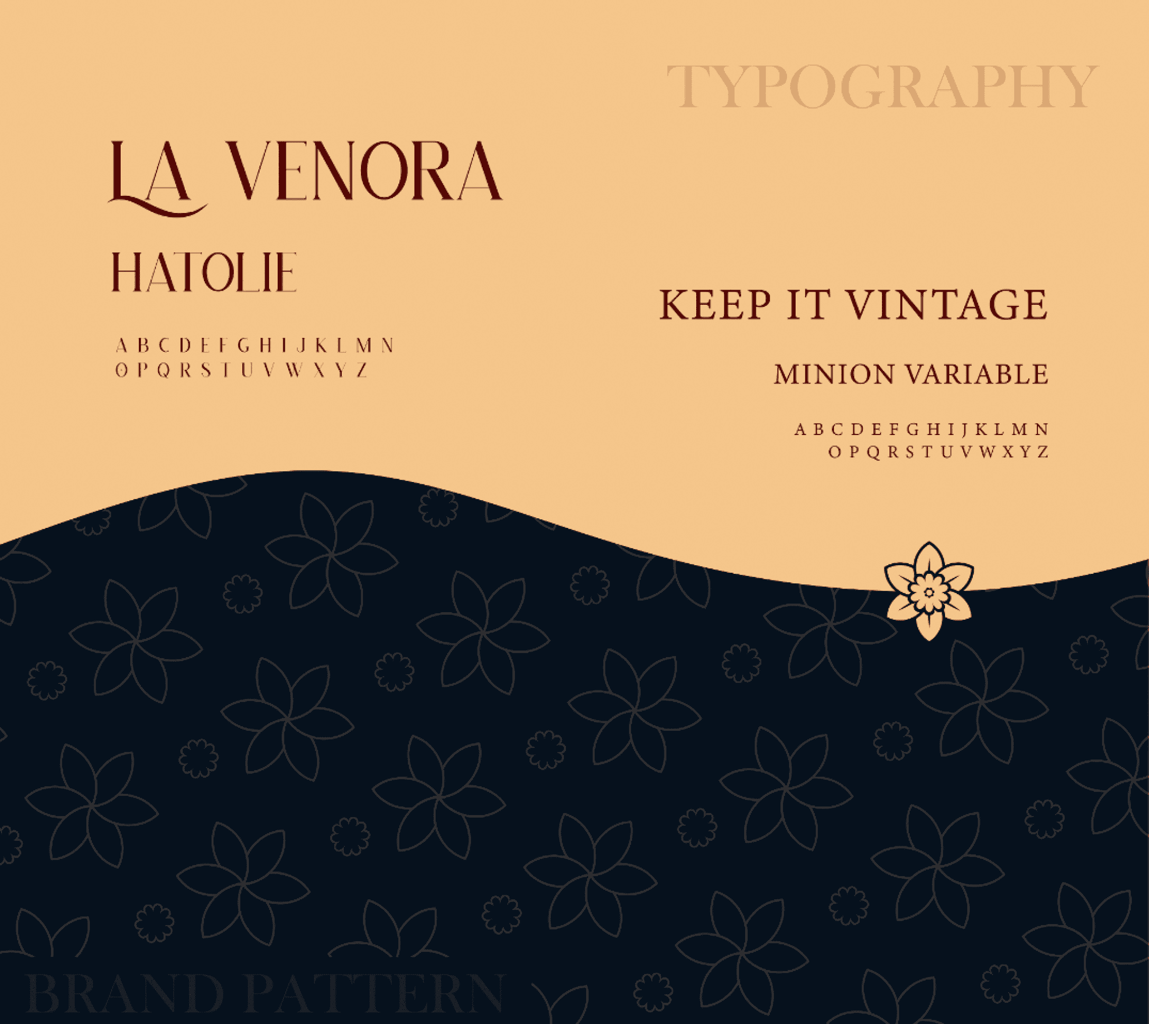
La Venora’s visual identity draws from a palette and typographic system that together reflect the brand’s quiet confidence and timeless class.
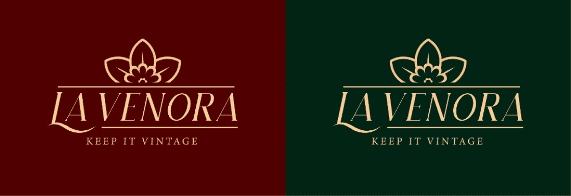
Color Palette – Old Money Sophistication:
Champagne Beige (#F4C78C): Understated luxury
Deep Navy (#07101E): Calm authority
Oxblood Red (#520000): Tradition and depth
Ivy Green (#022615): Heritage and harmony
These tones ground the brand in a refined, vintage-inspired world — subtle, composed, and unmistakably premium.
Typography – Editorial Elegance:
Hatolie: A vintage serif with graceful character, ideal for titles and wordmarks
Minion Variable: A timeless, high-legibility serif that supports extended reading and body copy
Together, they balance modern editorial clarity with classical charm, ensuring every word feels as polished as the garments themselves.

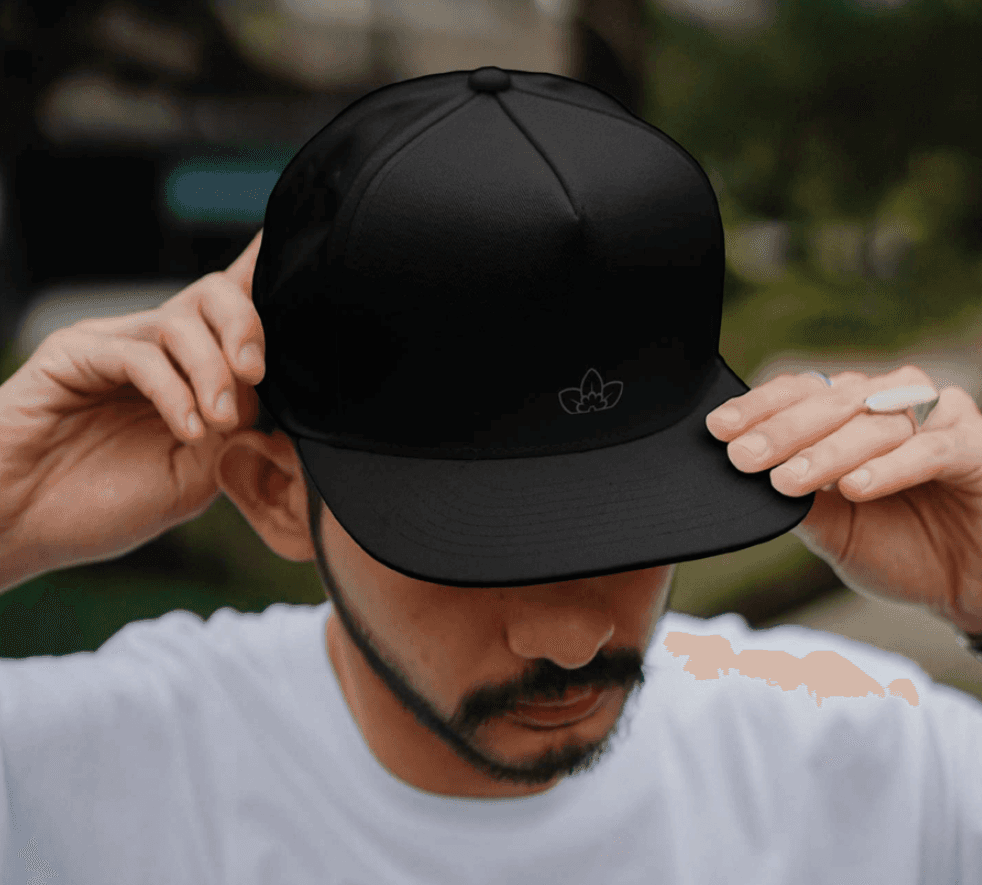


Brand in Action
La Venora’s identity extends beyond the logo - it’s stitched into every fiber of the brand experience. From tags to trims, each touchpoint reinforces its vintage luxury essence.
Woven Labels & Tags: Elegant neck labels and hang tags designed to reinforce vintage sophistication.
Size & Care Tags: Minimal, functional, and on-brand with thoughtful layout and iconography.
Trim & Stitch Detail: Custom trims and folds that preserve brand tone even in the smallest placements.
Tactile Presence: Every label feels premium, mirroring the product’s quality and La Venora’s ethos.

Final Words
La Venora is more than a brand, it’s a statement of quiet truth and enduring style. The daffodil, pulled from poetic history, becomes a symbol of clarity in a cluttered world.
Because true elegance is never loud — it's lived, not shown.
Next Project
Get a sneak peek at what’s coming next—innovation in the making

