

GCT, Coimbatore Logo Redesign
Preserving Legacy. Enhancing Identity.
Overview
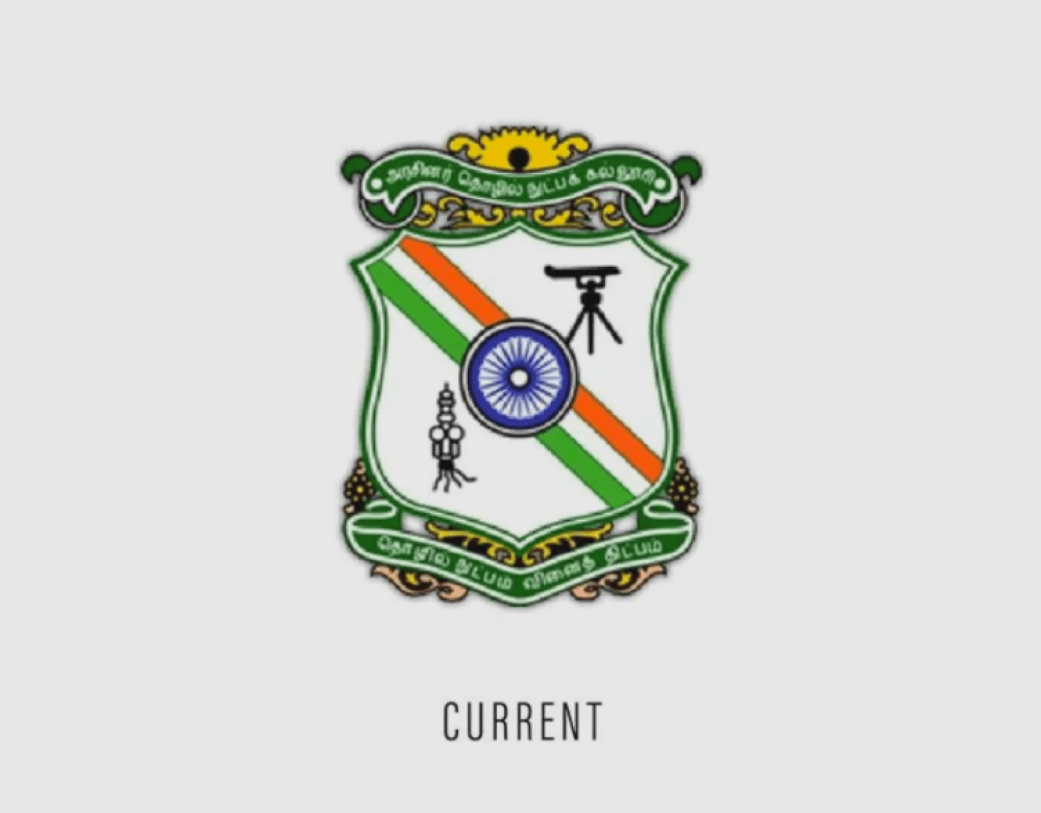
The GCT emblem, originally designed in 1951, has long symbolized the college’s commitment to engineering excellence and national pride. However, after decades of use and inconsistent digital adaptations the logo no longer met the visual and technical standards expected of a modern institutional identity.
In 2023, the GCT Alumni Association officially commissioned a redesign of the emblem. As a final-year student and a designer deeply connected to the college, I was honored to lead this project with the goal of modernizing the emblem while honoring its legacy.
Background & Problem Statement
The original emblem was a powerful symbol of institutional pride, but it faced several practical and visual limitations
Challenges Identified:
Outdated visual style with inconsistent versions in circulation
Difficult to reproduce in digital and print formats
Overcomplicated elements with poor visual hierarchy
Mismatch in color fidelity, line weight, and typography
No existing vector version for scaling and adaptation
Research & Inspiration
To ensure the redesign was respectful yet impactful, I began with a deep-dive into the emblem’s history and broader academic symbolism.
Research Activities:
Analyzed previous emblem versions including the original 1958 version and the most recent raster copy in use
Studied engineering-specific icons such as the theodolite, spark plug, gears, and books
Reviewed Indian institutional identities (IITs, NITs, public universities) for tone and visual balance
Consulted peers, professors, and alumni to understand the emotional weight of existing symbols
This process helped shape a clear understanding of which elements needed preservation and which required rethinking.
Redesign Process
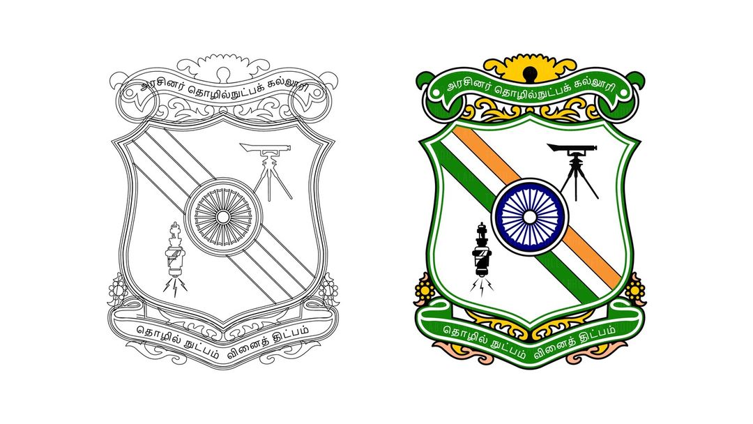
Phase 1: Cleanup & Vectorization
Traced the emblem from low-res references using Adobe Illustrator
Removed artifacts and unclean paths
Reconstructed every element — the gear, the tools, the shield — with pixel-perfect precision
Standardized line weights, spacing, and stroke curves
Phase 2: Structural Redefinition
Rebalanced element placement: Ashoka Chakra, spark plug, theodolite, and the central gear
Adjusted shield geometry for symmetry and center alignment
Used grid-based spacing for optimal rhythm across components
Phase 3: Typography & Bilingual Harmony
Replaced outdated serif type with clean, modern sans-serif Tamil script
Ensured legibility in both Tamil and English text
Carefully retained bilingual hierarchy in the ribbon headers, preserving cultural and linguistic accuracy
Phase 4: Color & Contrast
Used exact Indian tricolor values:
Saffron: #FF9933
White: #FFFFFF
Green: #138808
Ashoka Chakra Blue: #000080
Created high-contrast variants for visibility across light and dark backgrounds
Developed full-color and monochrome versions for flexible use cases

Impact & Reception
The redesigned emblem was officially adopted by the GCT Alumni Association
Deployed across official communications, publications, banners, certificates, and merchandise
Feedback from alumni, students, and faculty emphasized the success in:
Retaining heritage
Enhancing clarity
Balancing tradition with modern design
Next Project
Get a sneak peek at what’s coming next—innovation in the making

